Bespoke Wedding Invitations

With wedding season just around the corner, we’ve been busy at The Kat & Monocle designing custom-made invitations. We always aim to create them to your exact specifications and they do not have to match our usual illustrative style.
The latest one is now at printing stage and we’re really excited to see how it turns out. Our clients, Claire and Laurence wanted to have an Art Deco theme, without it looking too obvious and so our brief was fairly open. Claire had taken a stunning picture, looking up at the staircase in Clissold House, Stoke Newington, where the couple are to be married. With the help of this beautiful photo and a good old mood board – always a good way to get the creativity flowing – we came up with the below results…

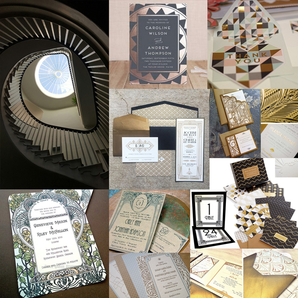
One of the lovely things about creating wedding invitations is being able to tailor them to the requirements of our clients. So much variety comes out of them and it’s refreshing to apply a different style to each design. It can be very satisfying to personalise them and Kat, our Creative Director, gets all sorts of interesting requests. Another recent commission from her clients, Breda and Matt, involved the use of our electronic cutting machine, (as the images below demonstrate), which is another excellent resource.

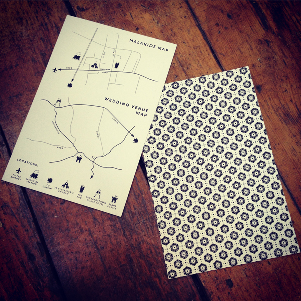

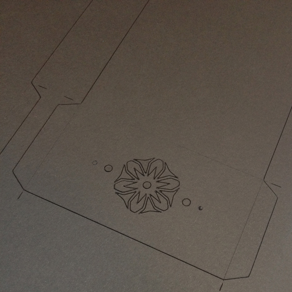
As you can see, the crisp, graphic lines are a far cry from our usual hand-drawn style and we really enjoyed developing them. Breda and Matt wanted a Japanese blossom theme for their wedding but they didn’t want the invitations to look too fussy. We loved their idea of having one of the flower motifs cut out out of a wallet, which held all the elements of the invitation together. The RSVP card – (which is actually a pale, coral colour with a beautiful sheen) – has been inserted face down into the wallet so that its colour can be seen through the ‘floral window’. We thought this was a lovely added touch and a fantastic idea on their part! They also wanted us to create a map for both wedding venues – another fun part of the invitations – and the graphic, floral pattern provided a decorative feature on the reverse of the front invitation. We love the Core Circus typography, which went perfectly with their request for a simple and contemporary design; and below is our electronic cutting machine in action, which was an invaluable tool in the making of the wallets.

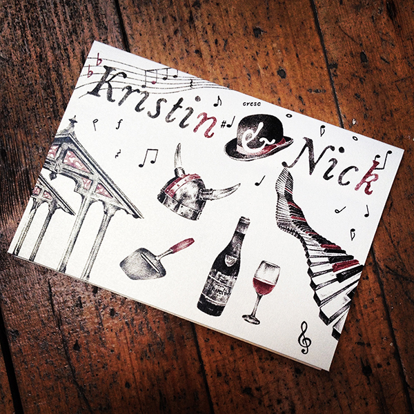
For anyone who is looking for our trademark style, we are still very happy to provide it. We designed the below invitations in 2015 for our clients, Kristin & Nick, with the idea of reflecting their nationalities and interests in their colour scheme of choice. We also ensured that there was an added dose of humour, as this is such an integral part of their relationship. Nick, is a musician from England and keen wine collector and Kristin comes from Trondheim in Norway, hence the bowler versus viking hats and the additional illustrations surrounding these cultures and landmarks. The Norwegian cheese grater gave us much amusement ;) and as an extra touch, the two hats leaning against each other were printed on the back of their RSVP cards and their order of service booklets, which we were very happy to design for them too.
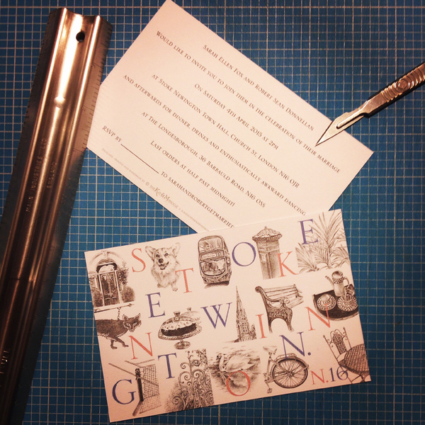
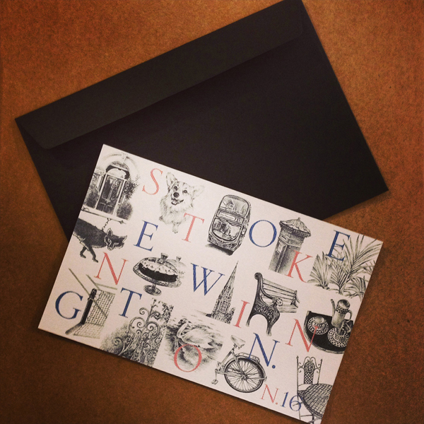
As we have mentioned, it is always interesting to hear about the invitation themes that our clients choose. Some do not necessarily want their names printed on the front and would prefer that another element of their wedding, such as its location or venue, is the main feature. Our clients, Sarah and Rob had spotted our commissioned ‘Stoke Newington’ postcard design, which we created for Hackney Council’s Destination Hackney Campaign in Summer 2014. They loved the fact that it incorporated so many elements of the area, (below left), which they felt were special to both of them, so they asked us if they could use the design for the front of their invitations.
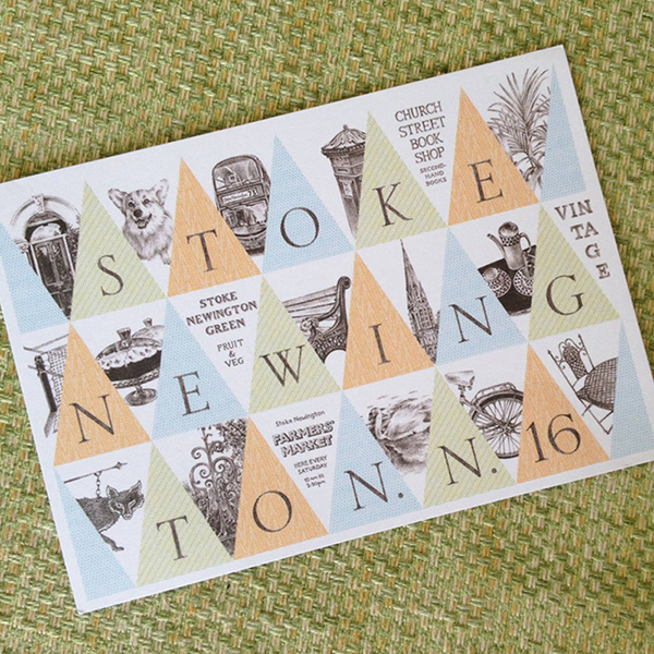
Luckily for them – and for Hackney Council! – we had created two layouts for the original postcard, so were able to offer our other design, (above right), which hadn’t been selected for the campaign. This way everyone was happy regarding exclusive rights to the designs and it was great to get the opportunity to utilise both of them. We definitely have Hackney Council to thank for promoting our business and it just goes to show that collaborations are beneficial in more ways than one.
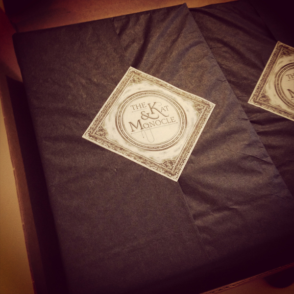
Each of the illustrations were hand drawn in detail, which weren’t much bigger than they are on the postcards/invitations. We’d therefore created a series of ‘miniature drawings’, which in its own right was a lovely project to focus on. The invitations were handmade, using the same materials and techniques as our Handmade Greetings Card range and were wrapped (as the below left image shows), to complete our personal service!
As always, we welcome any comments or feedback regarding our posts and if you are interested in gaining further information about our bespoke wedding invitation service, please don’t hesitate to get in touch….
….Ooh and in case you are interested, The Londesborough Pub, where Sarah and Rob’s and Claire and Laurence’s wedding receptions were held – is an excellent venue for a good old wedding knees up! – That is if you happen to be looking for venues in the Stoke Newington area :)

3 Comments
Kristin Wight
5th May 2016A huge thank you to the talented and very creative designer at The Kat and Monocle. Our wedding invites, RSVP cards, envelopes and service papers looked fantastic and the quality of the paper used was amazing. Thank you so much for helping us develop our ideas and turning them into something so beautiful and colourful.
Katrina Wight
6th May 2016It was our absolute pleasure Krisitn and lovely to work with the both of you! Thank you for your lovely comments and I’m so pleased you’re happy with them :)
The Kat & Monocle and How London Local Weddings Began -
8th August 2017[…] started to contact me to ask if I could design their wedding invitations and I very happily obliged. Some of these have been similar to my usual, intricate drawing style, […]